Friday, April 22, 2016

Week 10

Here's a link to my SRP PowerPoint:

SRP PowerPoint Presentation

_______________________________________________________________

MARIN COUNTY CIVIC CENTER

This week, I addressed the psychology of Wright’s organic architecture. Always aiming to shape the human with his structure, Wright fastidiously designed every aspect of his buildings from the exterior to the furniture to the lighting to the homeowners’ wardrobe to the dishes to even the napkins! He aspired for his structures to shape the way that people behave--whether in residences or in public buildings.

Wright’s 
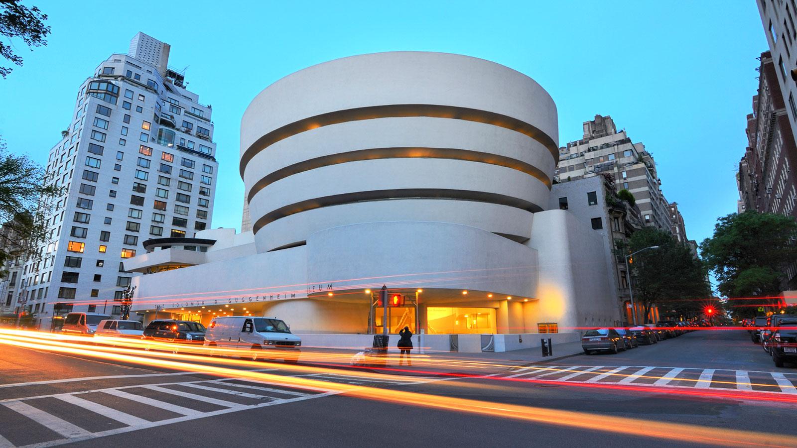
Guggenheim revolutionized the way that art museums display and visitors view art; his Marin County Civic Center likewise challenged traditional assumptions of what a government building should look like and function as.  


The last of Wright’s major works, the Marin County Civic Center was also the first of Wright’s government buildings. Looking more like a futuristic spaceship than a government office building, the Marin County Civic Center’s long V-shape, blue roofs, circular accents, and pointed tower seem to have leaped from the pages of a sci-fi novel.

Source: inhabit.com
Comprised of two long sections housing the Administration Building and Hall of Justice connected to a central rotunda at a 120-degree angle, the Marin County Civic Center is punctuated by a 52-meter high polygon-shaped tower, staying true to Wright’s geometrical style. The building’s light blue roofs mimic the color of both the surrounding hills and sky. Indeed, the building both looks and functions as an aqueduct, connecting the three hills and funneling the water flowing through the building into the ocean. Like all of Wright’s buildings, the Marin County Civic Center melds the rolling hills of the landscape with its domes spaced-out across the landscape. Golden spheres and accents celebrate the sunny California climate (“Key Works of Modern Architecture by Frank Lloyd Wright”).

Source: noehill.com
Here Wright pioneered the use of an indoor atrium. Open light wells stretch across the building’s long hallways, allowing natural light to filter in the entire building and providing each office with a view of the outdoors (Frank Lloyd Wright Quarterly Vol. 24 No. 4).

Source: Wikipedia
In fact, the Civic Center accomplished Wright’s mission for architecture to enhance the beauty of the landscape and make residents appreciate Nature more; upon the completion of construction, Marin County residents realized the beauty of the hilly landscape and decided to protect the landscape from further residential or commercial construction (Pfeiffer, Global Architecture: Marin County Civic Center).

Harkening back to Robie House’s novel attached garage, automobiles continued to fascinate Wright. The Marin County Civic Center was the first government building to address the post-World War II automobile culture taking over the United States, connecting to the highway and constructing access roads that run under the building’s archways. In fact, the building was intended to only be accessible by car (“Key Works of Modern Architecture by Frank Lloyd Wright”).

Source: Marinlibrary.org
The focal point of the Civic Center, however, is its prominent circle motif found everywhere from the archways to the payphones to the door handles to the water fountains to the signs. This design peaks with the domes that punctuate the building and thematically connect building to landscape (cnet.com).
Source: aviatorsandcameramen.com
Source: "Key Works of Modern Architecture by Frank Lloyd Wright"

While Wright often adapted shapes from the site’s natural topographical features, the shapes he chose hold a significance extending beyond linking outdoors and indoors. They impact the mental state of the visitors and residents by providing subconscious cues that tap into human’s most basic psychology: cognitive architecture.


The straight lines of squares, rectangles, and triangles imply stability and practicality, on account of the shapes’ association with the element of earth. However, without being offset by bright colors, the shapes give an air of uninviting coldness, as seen in the exterior of Unity Temple, a monolithic cube. On the other hand, Unity Temple’s light-colored interior transforms its square accents into the feeling of stability that religion provides. Likewise, in the Jacobs House, the warm colors of the russet wood, coupled with the rectangular shape of the house, provides the sense of practicality and efficiency that Wright strove for with his built-it-yourself Usonian houses. While vertical lines suggest aggression and strength, horizontal lines are associated with tranquility, unity, and harmony (creativebloq.com). The spiral of the Guggenheim Museum emphasizes the creative energy well suited for an air museum. Likewise implying growth and transformation, spirals break down rigid norms, just as the Guggenheim Museum overturned traditional museum design (designshack.net).

Continuing this theme in the Marin County Civic Center, Wright broke away from 100 years of courtroom design with his curved rows for spectators and jurors, curved tables for attorneys, and a lectern in the center to promote more direct contact with witnesses and the judge. Curved tables psychologically promote communication and consensus (notice the circular tables the next time you visit Starbucks, purposely chosen to be more welcoming and less lonely-looking than the more common square tables!).


Source: cnet.com
Here, blue connotes trust, peace, loyalty, and unity. The Marin County Civic Center’s light blue roofs play into the sense of harmony and democracy that the Hall of Justice and administration promote (Understanding the Meaning of Colors in Color Psychology).

My Marin County Civic Center lesson plan explores the psychology of cognitive architecture through shape and colors. This lesson introduces cognitive psychology: human preference for symmetry, colors, and shapes. Students will select a shape and color scheme representing building’s function (school, government, church, recreation), and then draw and color their design.
Source: everettpotter.com
(For all you biomimetic fans, you could even delve deeper into nano biomimetics of molecular biology: doesn’t the Civic Center look like a dividing cell?!).


Friday, April 8, 2016

Week 9

This week, you might be surprised to learn that I am focusing on a skyscraper—Wright’s one and only. Most architects traditionally earn their fame from designing skyscrapers—like Wright’s own mentor, the “father of the skyscraper” himself, Louis Sullivan, acclaimed for creating Chicago’s skyline. However, Wright, America’s most famous architect, atypically rose to prominence primarily from his residential commissions, with a few public buildings rounding out his oeuvre. As an anomaly, the Price Tower is all the more intriguing. What convinced Wright, who abhorred the vertical excess of urban architecture (as his spiral Guggenheim Museum elegantly defied in Manhattan), to cast aside his architectural aversion and embrace the challenge of constructing a free-standing skyscraper?

The answer remains a mystery. Perhaps it was the lingering ambition to finally construct an unused pre-Depression design that he had made for the St. Mark’s Tower complex in New York—which, if built, would have been the first entirely glass building in New York. Seen in this light, Wright’s abrupt reversal might not seem so out of character: indeed, he was constantly evolving, even daring later to conjure up a mile-high building for Chicago that never was realized either (“Frank Lloyd Wright’s Forgotten Plans for New York’s First All-Glass Towers”).

Thus, in the early 1950s, we find Wright, someone who claimed to be averse to tall buildings, even describing one skyscraper as an “incongruous mantrap of monstrous dimensions,” uncharacteristically persuading Harold C. Price to transform his simple office commission into a 19-floor tower stretching up 67 feet into the sky (The Atlantic, pricetower.org).

Price Tower stands today as a testament to Wright, an iconoclast who rebelled not only against society, but also against himself. 

Source: Bluffton.edu
_____________________________________________________________________

PRICE TOWER

Located in the small city of Bartlesville, Oklahoma, Wright built this one-of-a-kind skyscraper from 1953 to 1956 as the headquarters of the Price pipeline construction company. However, Wright’s Usonian experience had taught Wright the importance of being economical; so he decided to design rentable apartment spaces for offices and residences in order to bring in extra revenue for the Price Company (“Key Works of Modern Architecture by Frank Lloyd Wright”).

As discussed above, Wright had designed skyscrapers before when commissioned to build a St. Mark’s-in-the-Bowery cluster of apartment buildings in New York City; however, the reduced housing demand during the Great Depression left the plans unbuilt. Price Tower’s unique structure is actually borrowed from the radial design of one of these NYC apartment complexes (pricetower.org).

Source: architizer.com

Thus, Wright termed Price Tower “The Tree that Escaped the Crowded Forest” because the innovative design no longer had to be hidden among the clustered skyscrapers in New York City; it could now take its place in the spotlight to “cast its own shadow upon its own piece of land,” in the words of Wright. At the time construction was completed in 1956, Price Tower was by far the tallest building in Bartlesville (pricetower.org).

Source: greencountryvillage.com

This nickname, however, not only described the building’s location, but also highlighted the tower’s tree-based biomimetic structure. The four elevator shafts at the center of the building represent the trunk of the tree while the tower’s nineteen cantilevered floors taper out from the trunk like tree branches. The artificially-patinated copper exterior and sun-louvers imitate leaves, giving Price Tower its distinctive, tree-like green color. These louvers are not only like leaves in color, but in function; they help shade the predominately glass building from the scorching Oklahoma sun (“Key Works of Modern Architecture by Frank Lloyd Wright”).

Source: peterbeers.net

Likewise, the building’s top is narrower than its bottom—the top three floors get successively smaller to peak at the one-room penthouse floor—just as a tree’s trunk is thicker than its branches (pricetower.org). The trunk of the building provides more than just structural support; it symbolically unifies the building by integrating the various vertical and horizontal sections into a harmonious whole, just as a tree trunk grounds the winding branches (Architecture Daily).

All floor slabs are cantilevers anchored to four vertical shafts made of reinforced concrete. This affords the exterior walls to be comprised almost entirely of glass windows, even at the corners, needing only a parapet for support (“Key Works of Modern Architecture by Frank Lloyd Wright”).

Additionally, the “lines and divisions” of the tower—a design derived from the Price Company’s logo—help divide the space on each floor to create an innovative organization of rooms that bucked the traditions of regular office towers at the time. This organization necessitated a rotation of the axes of each floor by 45 degrees to create four quadrants. Three quadrants contained offices; the fourth, residences for rent (Architecture Daily). The office quadrants are marked by the horizontally-arranged copper louvers, while the residential quadrant is bounded by vertically-arranged louvers (“National Historic Landmark Nomination: Price Tower”).

Source: Pinterest 

This quadrant design led the interior of the building to be constructed on a parallelogram grid, which consisted of four 30-60-90 degree triangles centered around the bronze Price Company logo imprinted in the center of each floor. This grid dictates all aspects of the tower, from the furniture to the lighting. This grid system arguably seems inspired by Bartlesville’s orthogonal grid pattern (“Key Works of Modern Architecture by Frank Lloyd Wright”).

To visually connect the interior and exterior of the building, Wright used the same materials on the outside and inside of the building, including copper panels, concrete, and aluminum (pricetower.org). All of the exterior doors and window frames are constructed from aluminum; the exterior lighting, patinated copper (National Historic Landmark Nomination: Price Tower). In conjunction with the wide glass windows, this connection draw the eye outward, imploring those inside to explore nature—even though the tower was practically self-sufficient by uniting work and living spaces (pricetower.org).

Like all of Wright’s buildings, a geometric motif dominates the imagery. Triangles take center stage in Price Tower—from triangular columns to triangular lighting fixtures to triangular ventilation grills. Upon first entering the lobby, visitors meet a “distinctive disposition of planes (based on triangular or “flattened pyramidal” forms) that are repeated throughout the building” (National Historic Landmark Nomination: Price Tower). Many of the decorative accents in the building also featured triangles; a triangular glass and mirror mural by Eugene Masselink hung in the office of H.C. Price and a geometric wall mural was placed in Price’s apartment (“Key Works of Modern Architecture by Frank Lloyd Wright”). Wright claimed that had a strong affinity for the triangle “because it allows flexibility of arrangement for human movement not afforded by the rectangle” (The Atlantic).

Source: Wrightontheweb.net
Source: doi.gov

Price Tower, which Wright described as “an assertion of the American sense of itself,” blended modern and natural ideas—pairing the modern fluting, hexagonal form, and cantilevers with the basic tree structure. Exemplifying the late-19th and early-20th Century concept of Gesamtkunstwerk stressing that interiors and everything inside them should be a “total work of art,” the interplay of interiors and objects in Price Tower reveal Wright’s call for “the integrity of each in all and all in each” (National Historic Landmark Nomination: Price Tower).   

After the Price Company moved its headquarters, the Price Tower Arts Center took control of the building, converting the first two stories of the building into art galleries and reception areas, while much of the rest of the building became a hotel (“Key Works of Modern Architecture by Frank Lloyd Wright”).


 _____________________________________________________________________

BOTANICAL BIOMIMETICS

Source: wyss.harvard.edu

Last week, I argued that the Guggenheim Museum was a precursor to the contemporary biomimetic movement in architecture, adopting animal adaptations to architecture. This week, Wright’s tree-inspired Price Tower strengthens the biomimetic connection, validating his position in the vanguard of today’s biomimetic design revolution. Indeed, the trajectory from Wright’s nature-based design beginning with his Prairie Houses' stained-glass windows seems to point inexorably to present-day biomimetic architecture.

In the shadow of Price Tower, biomimetic architecture continued to plumb nature’s rich repository of evolutionary adaptations and competitive advantages in the realm of the plant world. 
_____________________________________________________________________

CONTEMPORARY BIOMIMETIC DESIGN

Nature is the consummate producer of prototypes, which have been tried and tested by eons of evolution. However, transforming these nano-sized, organic innovations into macro, artificial buildings uses nature as only a starting point, not a carbon copy of the finished product.

Here are some exciting examples. Can you find Wright’s footprint in these plans?


One example of modern biomimetic architecture inspired by a tree is White Tree, which was designed by a Japanese architecture firm and two French companies. Like Price Tower, it is multi-functional, including housing, restaurants, an art gallery, and office space. The walls, floors, and terraces of the building are all asymmetrical and permeable, similar to the branches on a tree (Seriouswonder.com).

Source: Seriouswonder.com


Likewise, the design for photovoltaic systems, which collect solar energy, sprang from the tree leaves’ process of taking in sunlight. Photovoltaic systems are water-gel-based, just like leaves, that combine plant chlorophyll and carbon to create a more effective solar panel. Researchers currently strive to create an even more energy efficient and biomimetic structure (Whole Building Design Guide).

Source: Whole Building Design Guide
Another leaf-based innovation has made its way into solar cells to increase their longevity. Leaves have the ability to repair themselves when damaged by ultraviolet light by dividing into more cells to replace the ones lost. A typical solar cell, however, cannot do the same. But scientists have discovered how to imitate the cell process of leaves in solar cells using proteins, bacteria, and water (Web Ecoist).


The Habitat 2020 building uses the idea of opening and closing pores of leaves to allow the building to breathe, with the small openings opening and closing throughout the day to let light, air, and water into the apartments. This semi-permeable membrane improves air quality and acts as natural air conditioning, cutting down on electricity cost and energy usage. The building’s skin even has the ability to collect and purify rainwater to be used in the building (Web Ecoist).

Source: Web Ecoist


In La Pineda, Spain, a seaside park features a biomimetic shading structure that imitates how pine trees sway in the wind. Even built at the same angle as the nearby pine trees, the salt-resistant fiberglass structure provides the perfect shade from both the sun and wind (“Web Ecoist”).

Source: Web Ecoist


In the arid deserts of Qatar, however, a tree does not seem fitting inspiration for a building. Instead, the new office building for the Minister of Municipal Affairs and Agriculture mimics a cactus—both in structure and in function. The building is covered with sun shades that open to let in air and light and close to keep out heat, just like how cacti retain water to survive long periods of drought ("Web Ecoist").

Source: "Web Ecoist"
_____________________________________________________________________

LESSON PLAN

In this lesson, students will start by learning about Wright’s tree-inspired Price Tower and then further explore examples of biomimetic architecture, particularly buildings inspired by adaptations of trees and other plants. Students will ultimately design their own biomimetic building based on a plant’s micro- and macro-properties suitable for specific climates. 

Source: dbu.de
Source: Royal Society Publishing

Thursday, March 31, 2016

Week 8

This week, my studies ranged from simple shelters to modernistic museums. These homages to Wright all share a common denominator: Nature. Nature informed and inspired each structure, dictating both form and function. In fact, sensitivity to and awe of Nature is arguably the most salient signature of Wright’s work. Yes, the geometry, the engineering, the American democratic ideal all greatly molded his abstract architecture, but Nature inevitability dictated its concrete design—from the Prairie local materials and site placement, to the Usonian hemispherical and honeycomb floor plans to finally the Guggenheim’s snail shell. In this way, I saw the trajectory of Wright’s influence linking the past to the present to the future. Hiking through the desert to visit the desert shelters built by Wright’s apprentices past and present, I witnessed Wright’s powerful influence on succeeding generations as they adapted building to environment. Researching his eighth UNESCO-nominated work—the Guggenheim Museum—I discerned Wright’s personal stylistic evolution, interjecting natural forms to suit the urban environment of New York City. Instead of grounding his design in landscape, Wright designed the art museum to turn in toward itself in a radical overhaul of museum traditions spanning back to the Roman Empire.

                             Guggenheim Museum; Source: aviewoncities.com

_______________________________________________________________________

DESERT SHELTERS TOUR


Besides realizing how grateful I am to have air conditioning, I began to truly comprehend Wright’s living legacy as I explored the desert shelters constructed by apprentices at Taliesin West. Rudimentary tent to pagoda to underground fortress to modernist cube: these self-designed dormitories seamlessly meld Wright’s hallmark accents—such as triangular shafts and blue and orange coloring—with the student’s personal stylistic interpretation.  


 Distinctive innovations—such as placing the fireplace under the cantilevered bed to warm the mattress during cold winter nights in the Brittlebush shelter—reveal the students’ modelling of Wright’s practical aesthetic sense—such as his innovative radiant floor heating systems.


Sometimes, students reside in previously-built shelters, often altering or completely revamping the shelter to fit their personal needs. Therefore, many shelters are constructed of biodegradable materials, allowing a new student to use the same foundation to develop their own structure once the old one has decayed.


Since many of the shelters are partially or totally open to the surrounding desert (some incredibly lacked doors—the ultimate open door policy), students truly experience Wright’s desire to unite building and nature. However, I think some shelters are a bit too harmonious with nature—I’m not sure how well I would cope with javelinas ambling through my room or a rattlesnake nesting in my fireplace!

__________________________________________________________________________

THE SOLOMON R. GUGGENHEIM MUSEUM

In a city dominated by towering skyscrapers and rectilinear buildings, the Guggenheim Museum certainly stands out, marching to the beat of its own drummer—Frank Lloyd Wright. Constructed on the east side of Fifth Avenue in New York City from 1956 to 1959, the Guggenheim’s dramatic spiral breaks the rectangular mold imposed on its neighboring buildings, which ranged from Beaux-Arts style townhouses to massive modern apartment buildings (“Key Works of Modern Architecture by Frank Lloyd Wright”).

Source: WWTW Chicago 
Wright’s Guggenheim Museum not only bucked against contemporary urban architecture, but also overturned the design of art museums stretching all the way back to ancient Rome. While ancient Rome was an incubator of architectural innovations, including the dome, vault, and arch, Roman engineering genius draped itself in Greek ornamentation and filled their museums with Greek-inspired art, robbing Rome of its cultural identity. Without taking into consideration the scale of their buildings or the arranged display of the art inside, Roman museums were reduced to “nothing more than vast inventories” (Bruce Brooks Pfeiffer, “Global Architecture: Frank Lloyd Wright Solomon R. Guggenheim Museum”).

Wright took Sullivan’s “form follows function” to the next step: form is function. Wright thought that classical architecture was a hindrance rather than an aspiration, causing countless architects to copy classical forms without regard to their suitability to the site, culture, or function. One particular pet peeve was the habit of designing every American town’s bank to resemble a columned Greek temple, despite the fact that the Midwest was nothing like the Mediterranean.

Yet ancient Rome was not the only culprit. Victorian era “Picture Galleries” covered walls in paintings and crammed statues into corners without concern for the most visually-enticing method of display. Instead of forging its own culturally appropriate museum architecture style, America mindlessly copied European museum architecture. Thus, Wright’s Guggenheim design marked the first time that a museum was designed to reflect the art that it housed (Bruce Brooks Pfeiffer, “Global Architecture: Frank Lloyd Wright Solomon R. Guggenheim Museum”).

Source: kudago.com
Housing modernist pieces by Mondrian and Weiss, Cezanne and Braque, the Solomon R. Guggenheim Museum’s defiance of architectural norms renders it a fitting home for the many pieces of modern art that likewise strove to change people’s preconceptions of what art is (Guggenheim.org).

Solomon R. Guggenheim’s art advisor, Hilla Rebay, encouraged Guggenheim to commission a museum for “non-objective art”—abstract art. Hoping for the museum to be “a temple of spirit, a monument,” Rebay immediately turned to Wright, who had constructed many temples throughout his career, whether for the worship of God or Nature. Wright derived his open, flowing design for the museum from some of his earlies works, particularly Unity Temple with its spacious communal room. If you recall my discussion of Unity Temple in Week 1, seats line three of the four sides of the cubical room ensuring that visitors’ eyes would not only fix upon the pulpit, but on those across the room, strengthening the sense of religious community (Arthur Lubow, “Smithsonian Magazine”).

However, the Guggenheim had a rough start: experiencing delays for sixteen years on account of the patron’s death, post-World War II increased cost of construction materials, and Wright’s myriad design changes.
Source: Pinterest
Even after finally breaking ground on construction, the Guggenheim Museum had not cleared the last of its obstacles: the critics. Colorful insults express the critics’ condemnation of Wright’s rebellious curved edges and lack of stratified floors, terming it an “inverted oatmeal dish,” “hot cross bun,” or “washing machine.” A stubborn man, Wright refused to give in to the critics and continued according to plan (Edward Lifson, NPR).

Source: haberarts.com
Yet even those who accepted Wright’s innovations had a concern: the magnificence of the building actually detracts from the artwork on display. While a typical museum’s lack of ornamentation or innovation forces visitors to focus solely on the art displays, the Guggenheim’s architectural grandeur shifts attention from art to building. The building itself was a modernist sculpture. Then-Museum Director James Sweeney elaborated, “This is the most spectacular museum interior architecturally in this country. But my job is to show off a magnificent collection to its fullest” (Perez, Architecture Daily).
Source: Earthrangers.com
Source: Andrewprokos.com
Surprisingly, even some of the avant-garde artists opposed to the museum’s design, hesitant about hanging their paintings on sloping walls. Indeed, the paintings do rest awkwardly inclined on the walls, tilted slightly backwards. This triggered a backlash by the artist community, with 21 artists signing a letter protesting the unflattering display of their work (Perez, Architecture Daily).

Despite the odds stacked against it, the Guggenheim Museum was finally opened to the public on October 21, 1959—six months after Wright’s death. Unfortunately, Wright would never realize the chance to see visitors enjoying his contested masterpiece of modern architecture (Guggenheim.org).

The Guggenheim, constructed from concrete reinforced with steel rods, is divided into three main parts: the main spiral dome, the small circular monitor, and the horizontal cantilevers that connect the other parts. Like always, Wright’s design for the Guggenheim was based on simple geometric shapes: circles, triangles, and lozenges. These shapes connect and interlock throughout the building: the spiral rotunda encloses the triangular staircase and elevator shaft; the circular monitor looks over the lozenge-shaped staircase (“Key Works of Modern Architecture by Frank Lloyd Wright”).

Source: Andrewprokos.com
The most innovative aspect of the Guggenheim Museum is the massive spiral rotunda, wrapping around five times to peak at the skylight dome 29 meters above the floor. This spiral draws the eye outward, making viewing art a collective experience. When exploring the Guggenheim, visitors not only view the piece they stand before, but their peripherals catch a glimpse of the art and the visitors beyond on the other side of the museum, encouraging them to contemplate juxtapositions and each other (“Key Works of Modern Architecture by Frank Lloyd Wright”).

Rather than being a static imposition of rigid floor upon rigid floor, the Guggenheim exudes a sense of motion—its wrap-around staircase and circular floors flow into one another like water, as if the viewer is “at the edge of the shore watching an unbreaking wave,” in Wright’s own words (Wright, In the Realm of Ideas).


Wright strove for simplicity and harmony with his design for the Guggenheim, creating a private world looking in upon itself, removed from the bustle of Fifth Avenue. Wright elaborated on his concept: “The atmosphere of great harmonious simplicity wherein human proportions are maintained in relation to the picture is characteristic of the building” (Bruce Brooks Pfeiffer, “Global Architecture: Frank Lloyd Wright Solomon R. Guggenheim Museum”).

In fact, this private world almost feels like an alternate reality. The lack of vertical or horizontal lines—or any straight lines at all, for that matter—creates a borderline surreal sensation in juxtaposition to the hard lines of the outside reality. This altered state of mind entices viewers to engage more deeply with the abstract art on display, seeing from new perspectives. Wright intended for visitors to first ride the elevator to the top of the building and then continue down the ramps to view the art after relaxing in the garden under the skylit dome. This sequence of activity would prime and relax visitors, maximizing the experience by letting “the elevator do the lifting so the visitor could do the drifting,” in the words of Wright (Edward Lifson, NPR).

Source: Guggenheim.org
Always a trailblazer, Wright’s daring innovation created a new standard for museum architecture; his reinvention dismantled the past and ushered in the future—most prominently, Frank Gehry’s Guggenheim Museum in Bilbao, Spain picked up Wright’s deconstructing-the-box baton and continued the trajectory of architectural innovation with his Deconstructivist style.

Frank Gehry's Guggenheim Museum in Bilbao; Source: rubenpb.com
Currently, biomimetic design is becoming an increasingly popular school of architecture. Here is an example of a project currently under construction in China using parametric design to construct the fish-shaped building, complete with light-reflective and shade-producing scales, using twelve two-dimensional curves (dezeen.com). 


Source: dezeen.com (top and bottom)
One of the biggest insights I gained from my surveys was that creative design--not physics--was the factor underlining most of the interest in architecture. Coupled with the added insight that biology was a favorite subject of many, I thought that biomimetic architectural design would be a great way to attract students to the current direction of architecture. 

My lesson plan for the Guggenheim Museum builds upon last week's project on passive sustainability by introducing biomimetic design, which uses designs and systems found in nature as a basis for sustainable architecture and materials. The Guggenheim Museum’s central spiral—an abstracted interpretation of a nautilus shell—stands as a precursor to the biomimetic movement. The lesson calls upon students to develop their own building inspired by an environmentally-fit adaptation of a plant or animal, for example, the scales of a fish, shell of a nut, radial symmetry of a sand dollar, petals of a flower, feathers of a bird, pine cones, and pea pods. 

Source: exploration-architecture.com